本项目基于对真实成绩数据的分析,展示了如何使用 R 语言进行数据分析。主要内容包括数据读取、描述性统计分析、正态性检验、多分组比较、图片美化等。
数据读取
读取全部成绩数据。这里去掉了成绩为 0 的数据,因为这些数据可能是未参加考试的学生。
# 读取数据 library (tidyverse)# 这里使用的是不含有学生真实姓名的匿名数据 = read_csv ("./data/score/score-anonymized.csv" ) |> filter (grade > 0 ) # 去掉成绩为 0 的数据 # 查看数据集的前几行
# A tibble: 298 × 4
   group role   name                             grade
   <dbl> <chr>  <chr>                            <dbl>
 1     1 leader 6615cc6c8c7912dbedc4a7a34a1ef30c    79
 2     1 member 019ba56b8d3607d60f2874496061643a    95
 3     1 member 4c18826f2d9fe9109c55a8c98fcd8b15    81
 4     1 member ba282a65bf882e5230af6c5d371ea2f0    79
 5     1 member c4bef7c9914dd2f984389922335b4fdc    86
 6     1 member d09c322f37e06e18ba37f385d64e6c3b    81
 7     1 member 3f7c71dfbc00799d461285593e02023a    85
 8     1 member 1b9de69574bc33486eb6bf921a93a99e    91
 9     2 leader 735ff5379fdedfc92a86ab6db937a6e5    76
10     2 member cfe087466143f41c0e13d034f7e21844    77
# ℹ 288 more rows
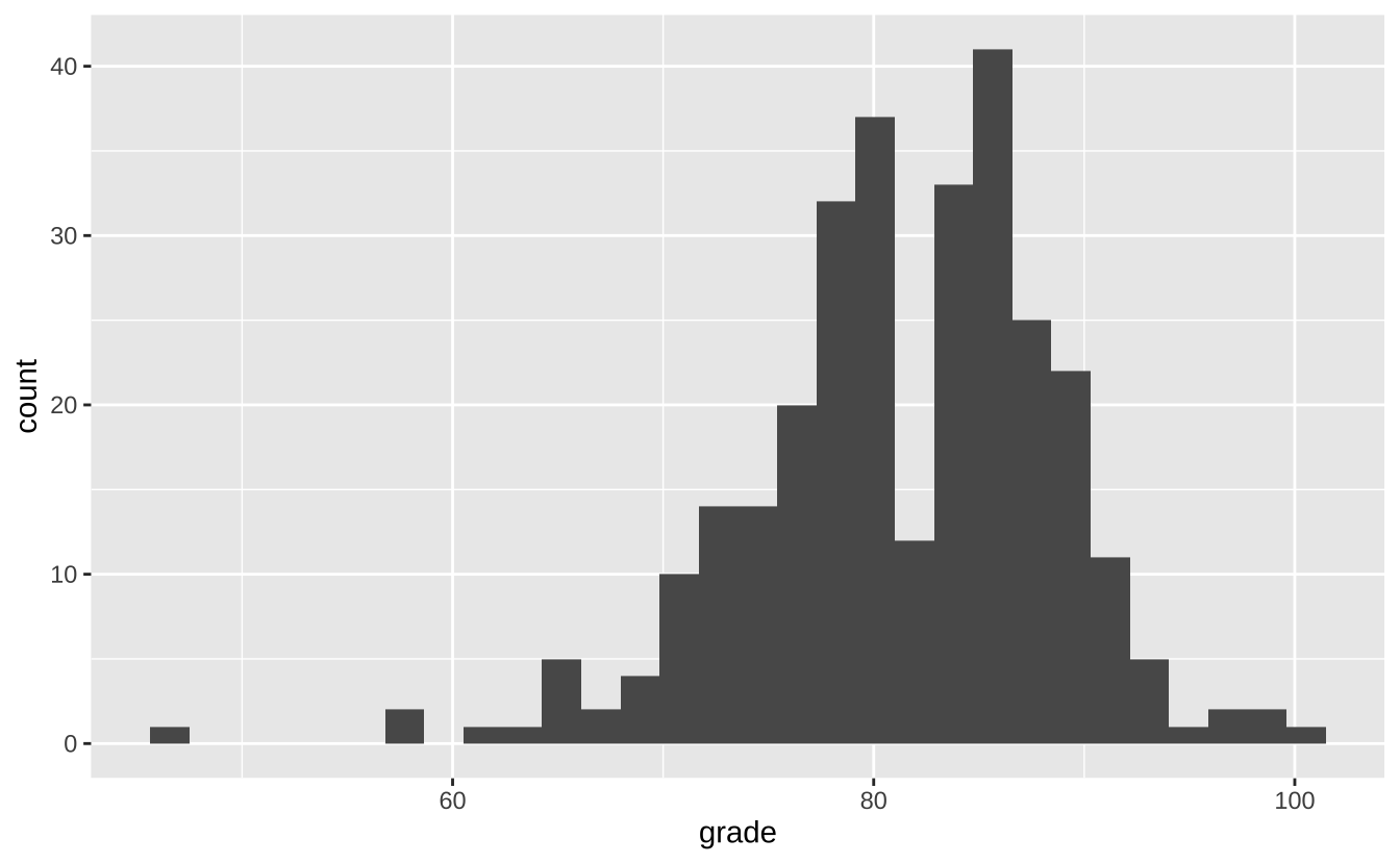
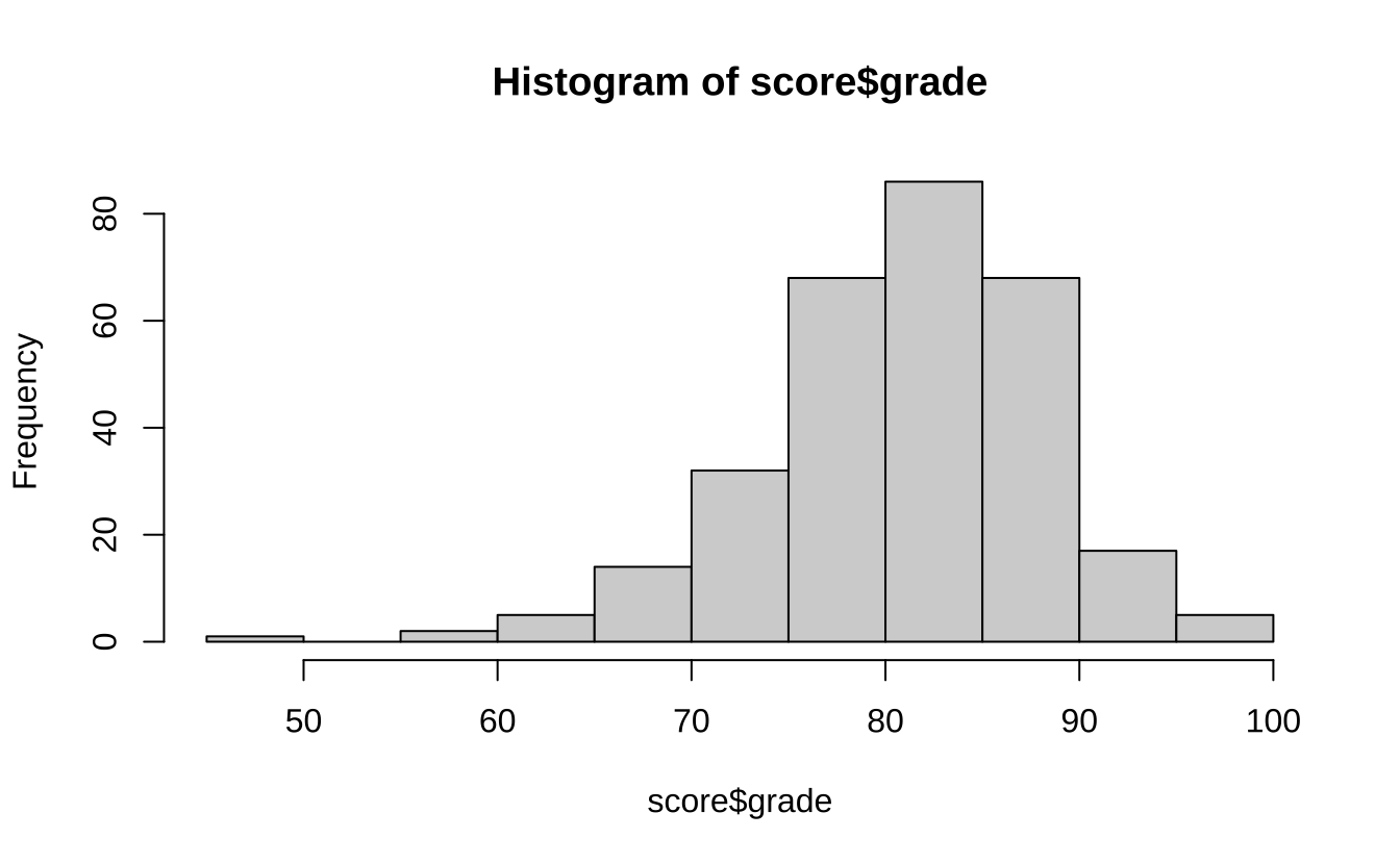
接下来,我们对成绩数据进行描述性统计分析。使用 summary 函数可以得到数据的基本统计信息。使用 ggplot2 包中的 geom_histogram 函数可以绘制直方图。
# 描述性统计分析 summary (score$ grade)
   Min. 1st Qu.  Median    Mean 3rd Qu.    Max.
  46.00   78.00   82.00   81.44   86.00  100.00
# 检验成绩分布情况可视化 ggplot (score, aes (grade)) + geom_histogram (bins = 30 )
正态性检验
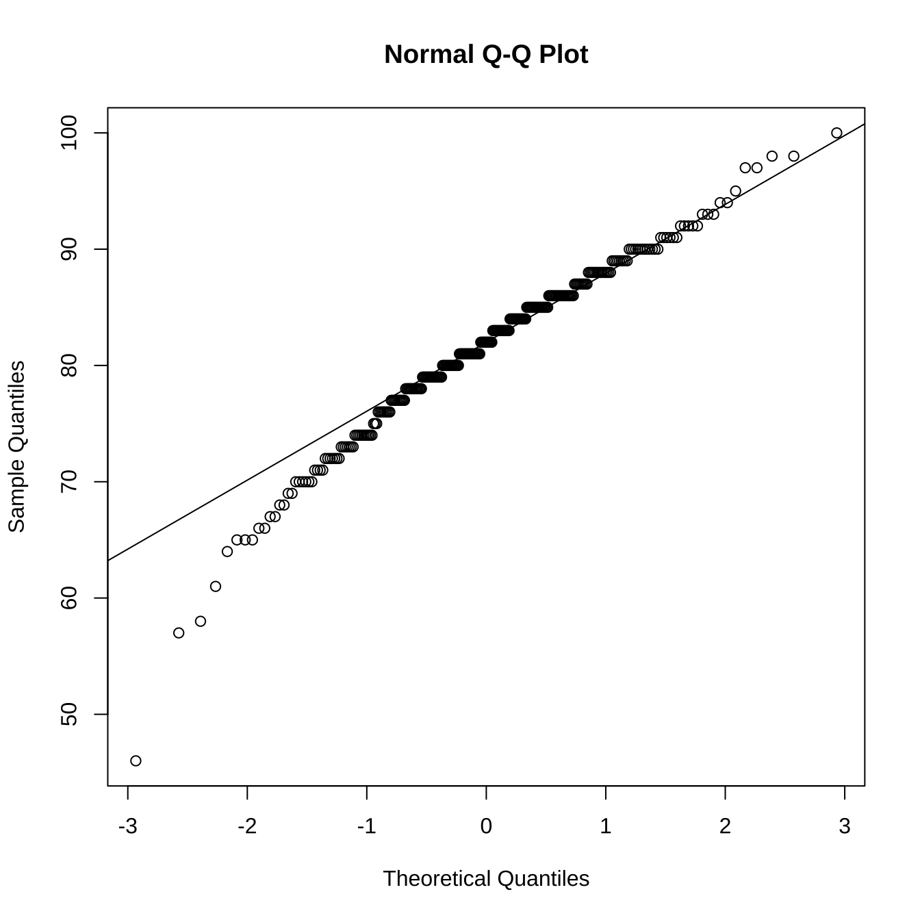
检验是否符合正态分布。
# 可视化检验正态性 qqnorm (score$ grade)qqline (score$ grade)
# 正态性检验 shapiro.test (score$ grade)
    Shapiro-Wilk normality test

data:  score$grade
W = 0.96996, p-value = 7.047e-06
上面通过了 3 种方式检验了成绩的正态性,他们分别是直方图、QQ 图和 Shapiro-Wilk 正态性检验。从直方图和 QQ 图可以看出,成绩数据大致符合正态分布。而 Shapiro-Wilk 正态性检验的 p 值为却远小于 0.05,说明成绩数据不符合正态分布。
在这种情况下,我们可以使用非参数检验方法,如秩和检验、秩和检验等。
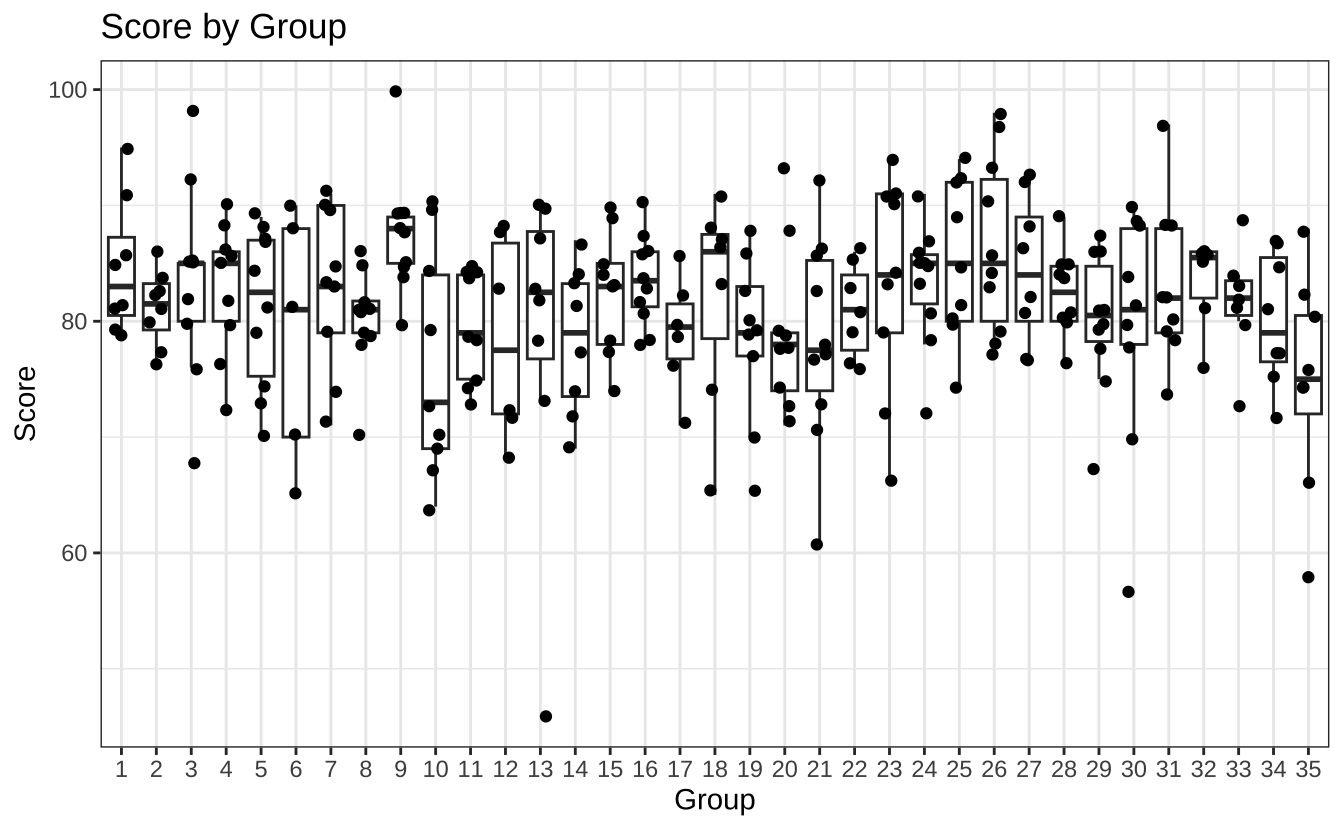
按分组统计
我们看一下各个分组的成绩情况,比较一个各个分组的成绩是否存在显著差异。
因为成绩数据不符合正态分布,所以我们首先使用非参数性的多分组比较方法,如 Kruskal-Wallis 秩和检验。
# 检验多个分组间的成绩是否存在显著差异 kruskal.test (grade ~ group, data = score)
    Kruskal-Wallis rank sum test

data:  grade by group
Kruskal-Wallis chi-squared = 39.677, df = 34, p-value = 0.2317
这个检验的原假设是各个分组的成绩没有显著差异,备择假设是各个分组的成绩有显著差异。
根据检验的结果,p 值大于 0.05,我们不能拒绝原假设,即不同分组的成绩没有显著差异。
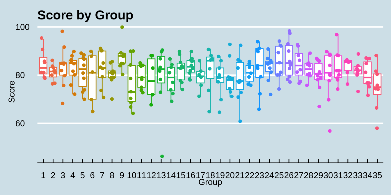
各个分组得分的数据可视化结果如下:
ggplot (score, aes (factor (group), grade)) + geom_boxplot (outliers = FALSE ) + geom_jitter (width = 0.2 ) + labs (title = "Score by Group" ,x = 'Group' , y = "Score" ) + theme_bw ()
因为我们使用的 geom_gitter() 来添加数据点,所以在 geom_boxplot() 中设置 outliers = FALSE 来去除离群值在 boxplot 中的显示,避免离散的数值显示 2 次。使用 labs() 函数可以方便的设置图形的标题和坐标轴标签。使用 theme_bw() 函数可以设置图形的主题为白色背景,更符合学术研究的规范。
图片美化
可能你会觉得上面的图形有些单调,我们可以使用 ggthemes 包中的 theme_economist() 函数来美化图形。
# 图片美化 library (ggthemes)|> mutate (group = factor (group)) |> ggplot (aes (group, grade, color = group)) + geom_boxplot (outliers = FALSE ) + geom_jitter (width = 0.2 ) + labs (title = "Score by Group" ,x = 'Group' , y = "Score" ) + theme_economist () + theme (legend.position = "none" )
这里我们通过将 group 映射为 color 来为不同的分组设置不同的颜色。并使用 theme_economist() 函数可以设置图形的主题为经济学家杂志(The Economist)的风格。因为分组数据已使用 x 轴显示,所以颜色注释是多余的。因此,这里使用 theme(legend.position = "none") 函数去掉了图例。
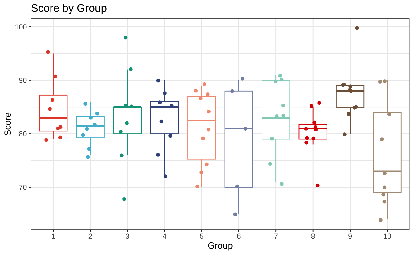
另外,还想介绍一个适用于论文发表的图形主题包,它的名字叫 ggsci。这个包提供了一些适合于科学研究的调色板,如 npg、lancet、jco 等。这里我们使用 npg 主题的调色板来美化图形。
# 图片美化 library (ggsci)|> filter (group %in% 1 : 10 ) |> mutate (group = factor (group)) |> ggplot (aes (group, grade, color = group)) + geom_boxplot (outliers = FALSE ) + geom_jitter (width = 0.2 ) + labs (title = "Score by Group" ,x = 'Group' , y = "Score" ) + scale_color_npg () + theme_bw () + theme (legend.position = "none" )
需要注意的是,因为自带的 scale_color_npg() 函数仅包含了 10 种颜色,而我们的分组有 35 个,所以这里使用了前 10 组的数据来演示。